The Old Experience and Improvments
After analyzing the old experience, we identified what was effective and what needed improvement.
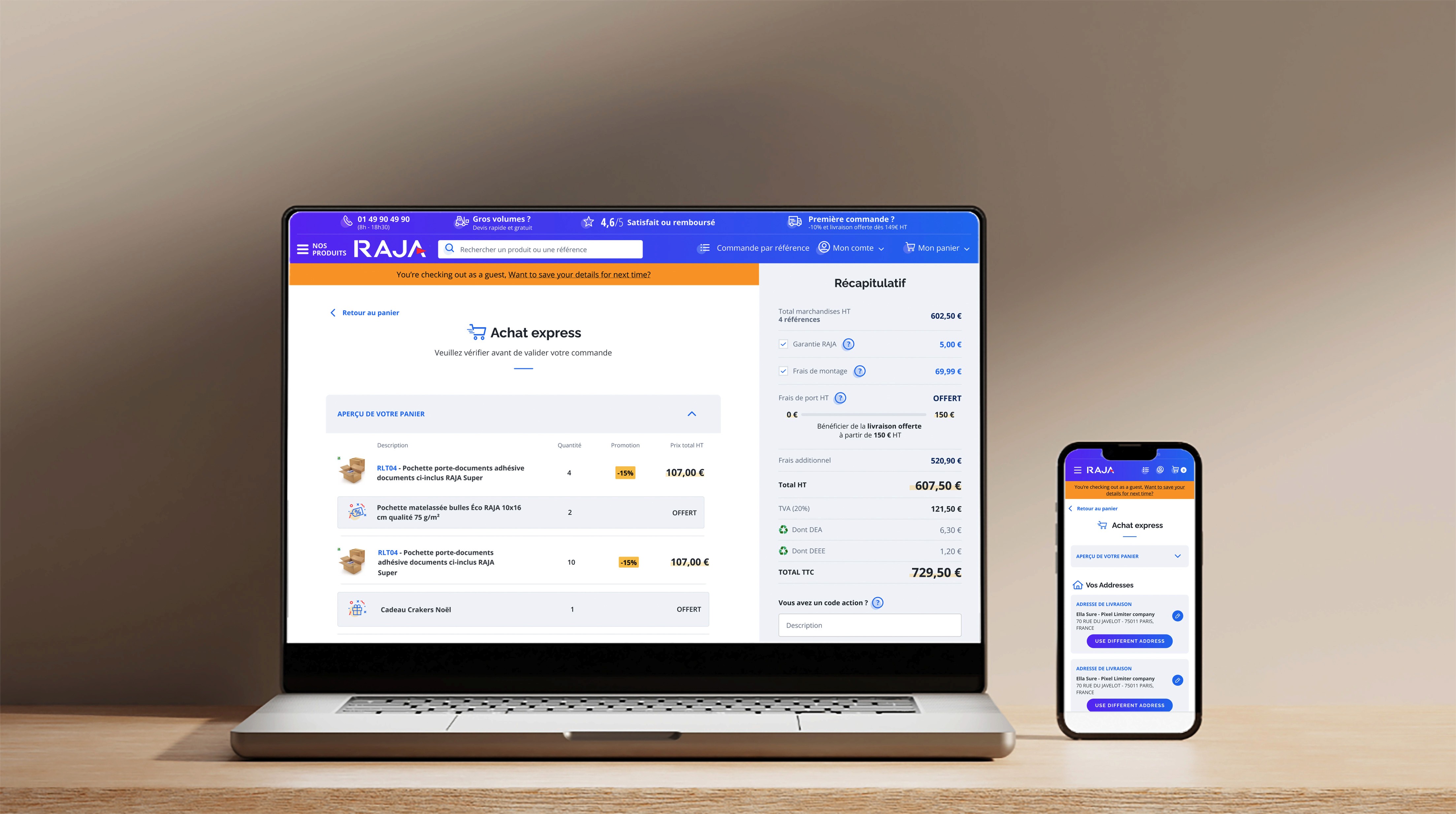
Guest User Awareness & Clarity : Problem: Nowhere does it confirm if the user is in "guest checkout" mode or logged in — this causes context loss.
Improvement: I have added a small message with a catchy background using Raja color style at the top saying: “You’re checking out as a guest. Want to save your details for next time?”

Address Edit Flow : Problem: Addresses are shown as blocks but it’s not clear how to change or add a new one (especially for guests).
Improvement: I make the able more obvious, e.g., change to: Modify address
and Added a “Use different address” button below each block to make it more discoverable.
on the delivery mood I have added this friendly message“Where should we send your order?” giving a conformability for users Specially if he/she is a guest

Address Validation with one click : Problem: Poor discoverability and validation when changing/adding an address.
Improvement: I adding auto-complete (e.g., Google Maps API), better placeholders, and live zip/city match validation

Payment Area Trust & Simplicity : Problem: For guest users, entering card info feels risky if trust signals are weak.
Improvement: Add trust badges: Display the payment section with trust indicators like “SSL Encrypted,” “Data Protected,” and a note such as “Your details are securely saved” to build user confidence.

The Design Process
We reached the deadline, but approval for the brainstorming took a little longer as the business team carefully considered the impact on the large number of users in our database. Defining the problem for our older client segment required additional review, and we needed the Product Owner’s approval before moving into the design phase.

Design Decision
I conducted a detailed analysis of the user journey map to identify the most frequently clicked points. Based on these insights, we can introduce additional options or adjust the sequence of actions during the guest checkout process to reduce user frustration and improve the overall experience.


Improvement applies
RAJA receives a high volume of visitors, many of whom have a traditional mindset and limited familiarity with digital technology. To accommodate this user group and reduce friction during the purchase journey, the guest checkout option is the most suitable path. It's essential to ensure they always feel oriented and confident at every stage of the process to prevent cart abandonment. This can be achieved by clearly highlighting the current step in the checkout flow and ensuring all components are as simple, intuitive, and understandable as possible.

Desktop First. Mobile Later.
Since 88% of RAJA’s users access the platform via desktop, I prioritized designing for the desktop experience first, then adapted and optimized the mobile version based on the desktop layout.